Q: What types of visualizations were you able to generate in Excel using PivotChart? How could those visualizations shape or impact your understanding of the data? Did you generate any visualizations that were confusing or misleading? Alternatively, did you generate any visualizations that were unexpected or illuminating?
I played around with different types of graphs like bar charts, pie charts, and line graphs. This is one of the bar charts I created.
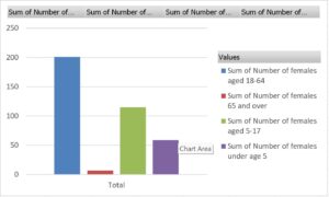
Bar chart showing the number of females in each age range.
This was useful to understand what percentage of females in that population were in each age range. Like the discussion we had in class, this could be useful to analyze the composition of the population, why specific age groups were much larger, and why census-takers chose this range in the first place. A visualization like this makes it much easier to think about these questions, as opposed to just looking at numbers.
One of the visualizations I tried doing was a pie chart showing the distribution of people in each age group, but I accidentally left out one of the fields, so it looked like there were way more children than adults, which we know is not true. While it was my fault, I can see how a small error like this can potentially have big consequences with much larger datasets and more variables. Mistakes can always happen!
0 Comments